Pure CSS modal
Created on
19 Mar 2019
Updated on
20 Jan 2021

There are many ways to create modals, you can use any of the awesome javascript libraries out there that can create customizable cool modals or create one by yourself
Modals are usually created using javascript since a standard modal opens on a click event and closes when clicked on a close or action button.
However, a customizable modal can be created entirely using CSS, provided you have control over your HTML file.
In this post, I will demonstrate the creation of a pure CSS modal using the input radio elements.
The idea is to place the modal right next to a radio button, which will act as a button. The :checked and + selectors are used to show the modal when the “button” is clicked.
The HTML
<div class="card">
    <div class="content">
        <h1>Modal</h1>
        <label class="modal-open modal-label" for="modal-open">
           <p>Open Modal</p>
       </label>
        <input type="radio" name="modal" value="open" id="modal-open" class="modal-radio" />
        <div class="modal">
            <label class="modal-label overlay">
                <input type="radio" name="modal" value="close" class="modal-radio"/>
            </label>
            <div class="content">
                <div class="top">
                    <h2>Heading </h2>
                    <label class="modal-label close-btn">
                    <input type="radio" name="modal" value="close" class="modal-radio"/>
                </label>
                </div>
                <p>Lorem ipsum dolor sit amet, consectetur adipiscing elit, sed do eiusmod tempor incididunt ut labore et dolore magna aliqua. Ut enim ad minim veniam, quis nostrud exercitation ullamco laboris nisi ut aliquip ex ea commodo consequat.</p>
            </div>
        </div>
    </div>
</div>
And CSS
.card {
width: 90%;
border-radius: 5px;
overflow: hidden;
background: #fff;
box-shadow: 1px 1px 18px -8px #263238;
color: #424242;
margin: 20px auto;
padding: 20px;
}
.modal-open {
display: inline-block;
border-radius: 10px;
background: #4caf50;
padding: 5px 15px;
color: #fff;
}
.modal-label {
position: relative;
}
.modal-radio {
position: absolute;
visibility: hidden;
opacity: 0;
}
.modal {
position: fixed;
height: 100%;
width: 100%;
top: 0;
left: 0;
overflow: hidden;
opacity: 0;
transform: scale(0);
transition: opacity .5s, transform .5s;
}
#modal-open:checked+.modal {
opacity: 1;
transform: scale(1);
}
.overlay {
position: absolute;
width: 100%;
height: 100%;
background: rgba(0, 0, 0, 0.5);
top: 0;
left: 0;
}
.modal .content {
position: absolute;
width: 70%;
height: 300px;
max-height: 70%;
top: 10%;
left: 15%;
background: #fff;
border-radius: 15px;
box-shadow: 0 3px 15px -2px #222;
padding: 20px;
}
.close-btn {
position: absolute;
width: 30px;
height: 30px;
top: 10px;
right: 20px;
border-radius: 50%;
border: 2px solid #f44336;
cursor: pointer;
}
.close-btn:after,
.close-btn:before {
content: "";
position: absolute;
width: 70%;
height: 2px;
background: #f44336;
left: 15%;
top: 50%;
top: calc(50% - 1px);
transform-origin: 50% 50%;
transform: rotate(45deg);
}
.close-btn:before {
transform: rotate(-45deg);
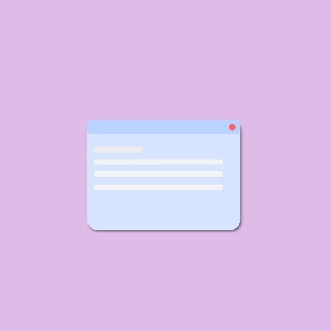
}Which gives the below output. Fiddle
Now how does it work?
We place the modal right after the radio button ( which is customized using the label to look like a button) so that we can use the + selector to it.
The modal is initially hidden by using transform and opacity. Once the radio button is clicked, the checked selector becomes active and the modal is shown.
You can see that a label with a radio button is used as the overlay in the background. This is done to hide the modal on click outside the modal.
Any button or click event that is intended to close the modal should have the same name attribute as that of the opening radio button.
Also checkout this codepen demo.
Comments
Post a comment
This site is protected by reCAPTCHA and the Google Privacy Policy and Terms of Service apply.